DashIn Website
In search of a gestalt
Role Research & Design
Employer Zero‐G, Dublin
Client DashIn
Year 2019
Employer Zero‐G, Dublin
Client DashIn
Year 2019
DashIn specialise in quality and convenience, selling hot food and top fuel brands to busy motorists on the East Coast. They wanted a new website that would reflect the improvements in their offer.
︎
Discovery
Our task was to elevate DashIn’s online brochure site to match the cleanliness, efficiency and quality of their instore experience.
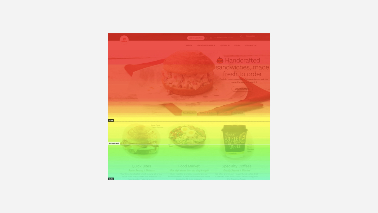
As lead researcher, I began by undertaking some quantitative research, surveying the existing analytics and tracking traffic via heat and scroll maps. We implemented a survey on the site to get some customer insight, and to garner feedback on the current online experience. Additionally, we compiled a survey for the internal team to identify critical business requirements. We surveyed websites of convenience stores, food service offers and gas stations for examples of clever, innovative and engaging features.

Next steps
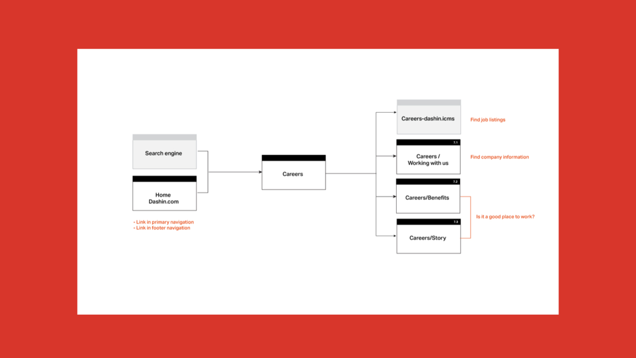
Emerging from our discovery learnings, we identified 6 use cases to focus on throughout the definition and creation phases of the project. We worked through and untangled some issues with navigation and functionality that existed on the current site, and designed a new site map and user flows based upon all our findings. As we moved into designing pages, we sorted content requirements into priority lists for each page and signed off with our client.
The design phase
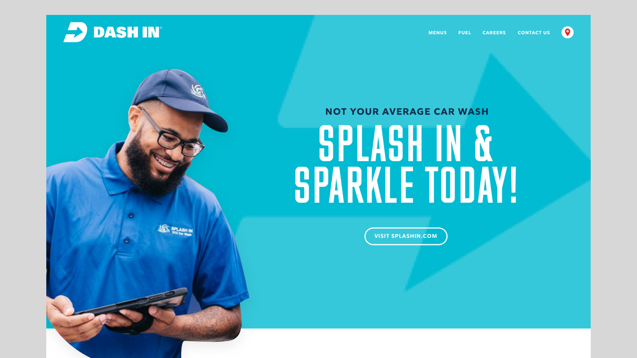
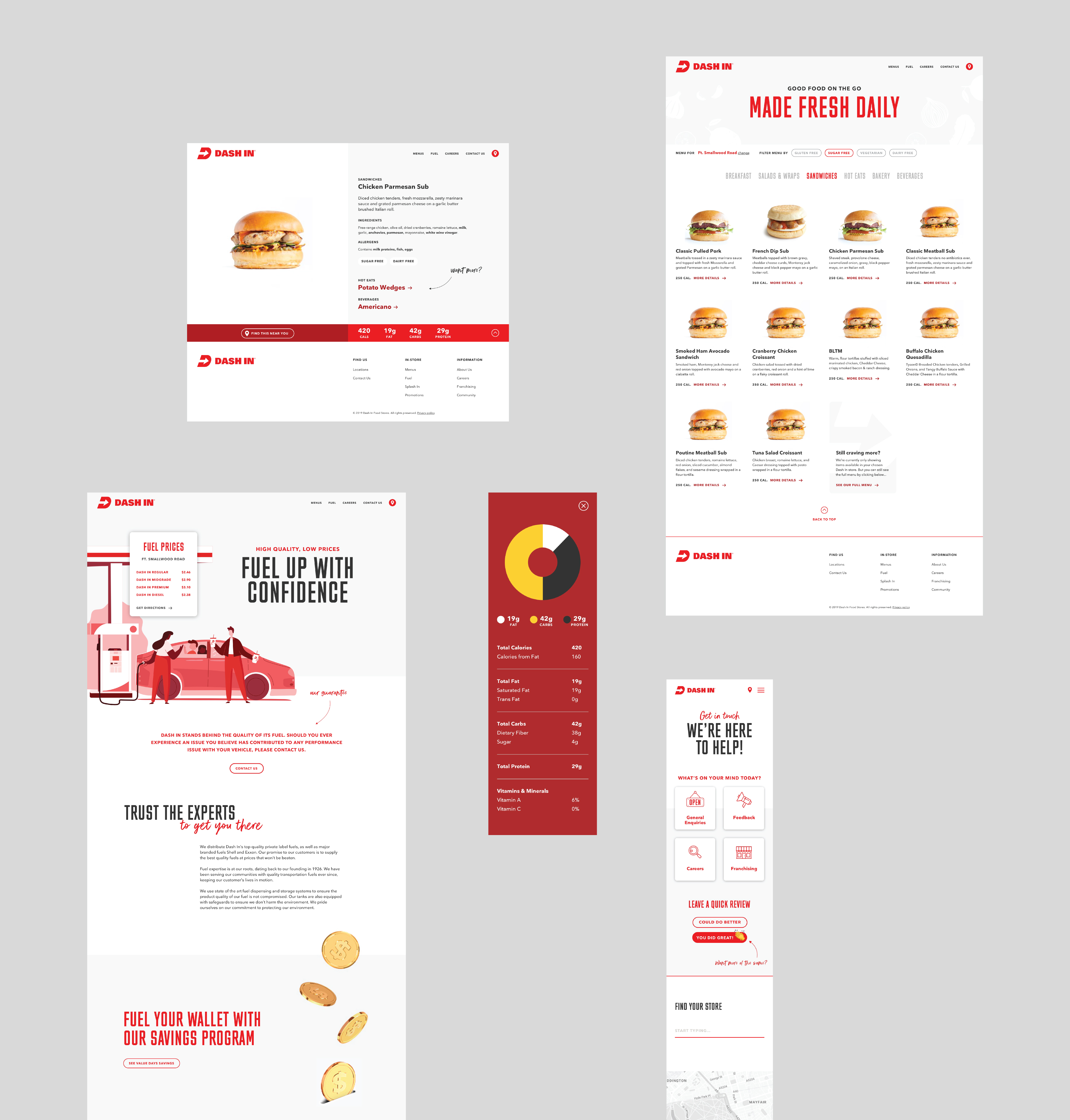
DashIn’s brand identity had been well-established in their stores and throughout their social media channels. My challenge as lead designer was to translate this onto their website, maintaining a bright and airy feeling, and creating a simple yet engaging user experience. Colour became a key variable, adding more or pulling back until we found the right balance, dialling up personality in the messaging as we experimented.


ge·stalt
/ɡəˈSHtält/
an organized whole that is perceived as more than the sum of its parts.
︎